Showing posts with label bead gel. Show all posts

Thursday, 5 April 2018

In the Meadow at Stamps and Stencils

Hi everyone, time for our next challenge at Stamps and Stencils and this month the lovely Rachel has chosen the theme which is all about meadows...

'Meadows are such amazing places - lots of different grasses, wild flowers and wonderful wildlife. Let your imagination run wild ...and use stamps or stencils too! Enjoy!'


What a lovely topic, time for fresh spring colours and I created some journal pages which is something I've not done for a while.


I like working on Kraft card and scraped gesso and some of the new blue paints from Seth Apters winter set, think Venice Blue, Steel Grey and Double Denim are making an appearance today. Floral and square stencils used on the first layers.


I've used one of my own hand carved stamps here as it matched in quite well with the geometric  elements.


More layering and stamping with a  little Toffee and Caramel paint.


Glass Bead gel, Treasure Gold and Decoart White Crackle paste.


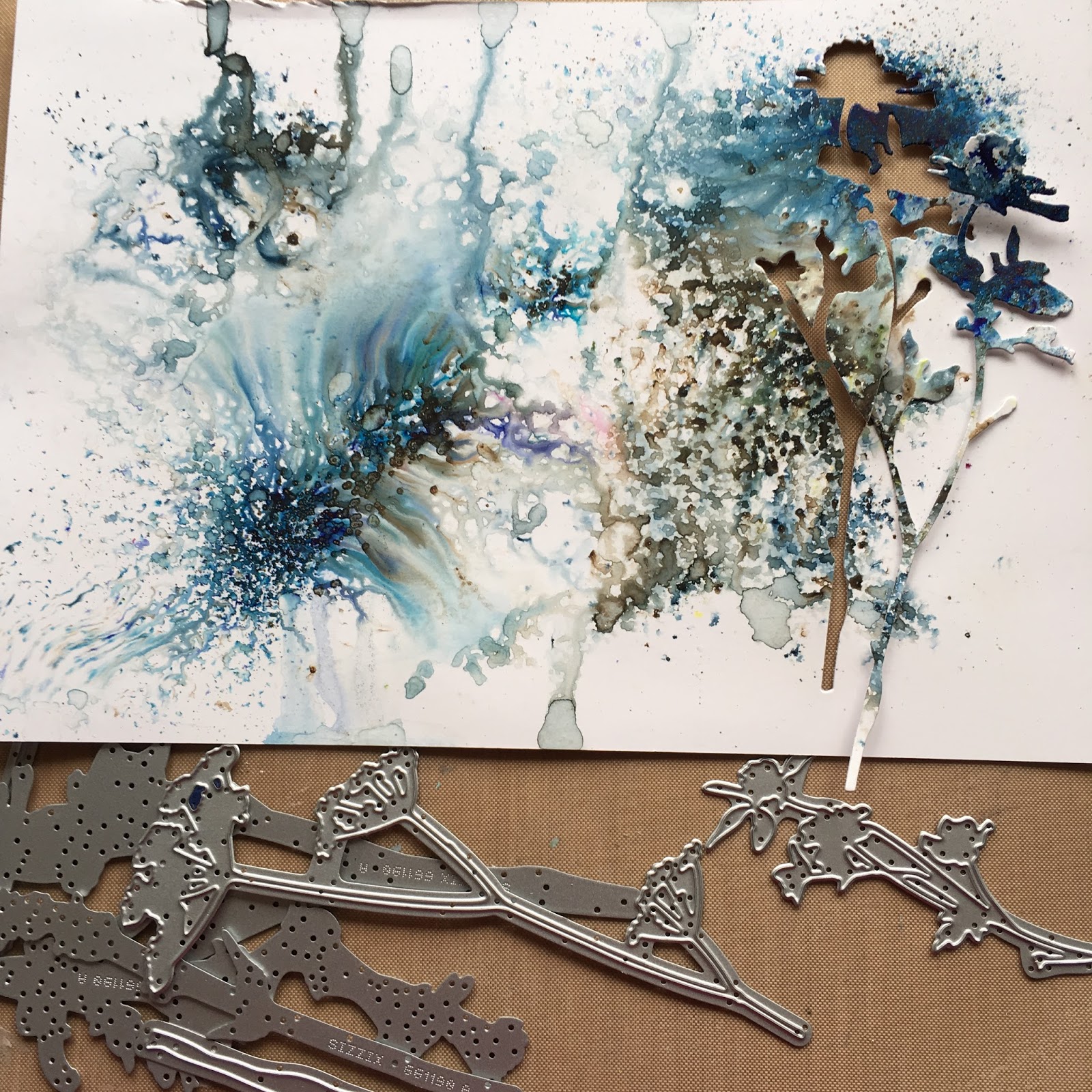
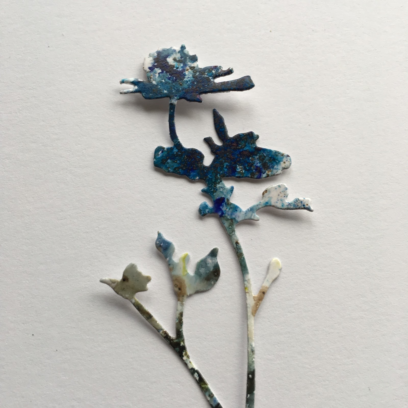
Sleight Blue and In the Navy infusions on glossy card stock before die cutting with Tim's Wildflower dies.


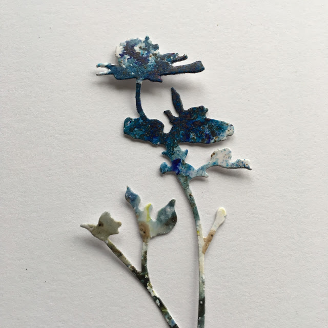
Isn't the effect pretty?


I used the waste as a stencil  too.


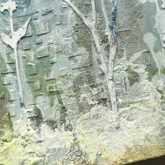
White textured 'earth' for the flowers to grow out of.


I do like texture..


Love the contrast of the glossy flowers against the background.


Hope you're inspired to join in, hop across here for more inspiration from the design team and as always thanks for stopping by. Ruth xx

Saturday, 6 June 2015

Blue Glass

Happy Saturday everyone!  Over at PaperArtsy the current challenge theme is 'Bottles'. I was inspired by Leandras video which included how to paint inside bottles and Emma Godfrey used this method in her post here. This set me thinking and having rummaged around, found one I liked the shape of and decided to experiment. This is the result.


I think the 'glass blue' paint name reminded me of some Swedish blue glass pieces that my mum has. I remember them vividly from childhood, the gorgeous blue and the rough patterned but geometric decoration. I found out they are Ruda glass by Göte Augustssonand here's an example.


Inspiration is just a starting point, for the inside I used glass blue and blueberry fresco and then for some reason decided I wanted some shimmer so I added some mica powder.....looks lovely but the paint took even longer to dry. 


I decided to mask off squares and rectangles and use glass bead gel. 


This usually dries much clearer but the layer was quite thick and I'd also added some interference blue silk glaze ( like you do) which may have affected it. Liked the result but how to make it blue?


Treasure gold in Sapphire and Indigo with some Mica powder dusted for luck. Still not as dark as I'd first thought but I'm happy with how it turned out. Hopefully when it's fully dry inside it might hold a single flower.  It's different anyway!


Thanks as always for stopping by, have a lovely rest of the weekend.

Thursday, 23 October 2014

Exchange Day at ATP

Hi everyone, it's my turn over at Artist Trading Post for today's Exchange Day. I've been exploring bead gel, (a product I love) and made a couple of journal pages in the process. To see all the details please hop over here.


Thursday, 2 October 2014

'Seeds and Beads'

Morning everyone, I'm delighted to be sharing my first post as a DT member for the ATP Exchange. Our first challenge is hosted by Sue and is an 'Anything Goes' theme. So what did I decide to make.


I took a piece of mount board about 8x8 and covered it with a piece of cotton. I then used the Clarity Seed Head stencil with Prima Bloom sprays in the following colours, irislime wedgeglistening waves and tea stain. I sprayed waves across to create layers of colour. They have a lovely shimmery effect. I also took some prints off the stencil that I will use for other projects.


I replaced the stencil after cleaning it and then used the lovely fine text stamp from the new Sara Naumann eclectica 11 set and archival inks in aquamarine, potting soil, blue violet and magenta hue.
I've used Golden glass bead gel before in areas on canvas but wanted to see what the effect would be on a larger area. If spread in thin layer you can still see all the colours and text through it.


I had also tried the technique on some Claudine Hellmuth canvas when experimenting and so I cut off a piece that I frayed to match a section on the bottom left. I stamped the text from Stuff to Say with potting soil and repeat stamped onto acetate and clear embossed it.


I used a little renaissance treasure gold just on the seed heads to add some definition and a gilding pen around the edge. Not the easiest to photo with glass beads and acetate but hopefully you can see the effect.
Please pop across here and see what fabulous makes my talented team mates have created and hopefully will inspire you.  As always thanks so much for stopping by. 

Tuesday, 22 July 2014

Fresco

Today I am very happy to be sharing this project, I made it for the Top Talent spotlight over at Our Creative Corner. Please hop across you'll find out a little bit more about me alongside my finished project. Such an honour...thank you OCC!

So what did I decide on, well they said anything goes...


....so I decided to get plastered.... read on


I started with an 8x8 box canvas and added a variety of torn scraps of paper. I had an idea that I wanted to try and create vintage worn images on a rough plaster wall and at this stage wasn't sure what would show through but wanted to add some depth.

I had some resin plaster and just mixed it up and poured...oooh!


I then added a variety of textures and trimmings and before it set removed them.


I scraped away some of the plaster and decided to add some bead gel into those areas. I really wasn't sure whether this would work or where it was going, but I was having fun!


Hopefully you can see the texture. I didn't take photos of the next few steps but after a rough coat of Fresco stone paint I stamped a variety of images onto 1 ply tissue in versafine vintage sepia; a mixture of architecture, scrolls, text and flourishes. The main (beautiful) image is from lost coast stamp designs and was my initial inspiration for the piece.


I used matte medium adhere the images, not forgetting the edges.


Then to bring all those neutral shades to life, treasure gold in renaissance, spanish topaz and florentine. Loved the effect on the bead gel.

I'll leave you with a photo taken in slightly different light. It was an experiment in texture for me and I loved doing it. Thanks for dropping by and don't forget to visit 'OCC' 


Tuesday, 25 March 2014

Hogwarts staircases and ATC part 2

What??.....well one of the blogs I follow is Barbara Gray's Blog and if you haven't seen her first post then this link sums up how starting a blog feels or put another way it's like trying to navigate the 'Hogwarts staircases.' You think you know where you are going and then you end up somewhere else, you may find something you weren't looking for and want but you'll never find your way back to it again. I still haven't worked out how to load blinkies and gadgets like my Pinterest link, sort  my background picture out properly and many other things....but I know I will.
So I just thought as I am late posting the ATC part 2 I'd take the opportunity now to explain why and apologise for any future slips and trips.

ATC part 2 


I 'ruined' the original paper with too much paint but then thought nothings really ruined, it's just going in a different direction, some distressing and it's a background to work on.


2 ATC's doesn't make a series ( is it 9 officially?) so make some more.


...but you can't repeat accidents, and  lovely as it is there was too much ginger peach primary elements.  


Some more  painting and distressing later to tone them in.


Collage elements


chit chat stickers


Glass bead gel on 3 of them. Inspired by Lin Brown I remembered I had some and although the stamped flower underneath has faded I like the effect. A little treasure gold to highlight.


I like the effect of Wendy Vecchi embossing paste here (Sue Carrington post) but I haven't got any so on the remaining 3 used some Viva clear croco I had instead.


Just a couple more photos to finish. Hope you enjoyed it, thanks for dropping by.