Showing posts with label time. Show all posts

Tuesday, 27 January 2015

CAS meets Steampunk!

Hi everyone, thanks for all the lovely comments you've left recently. A quick post from me today. Just thought I'd share a card I'd been asked to make. Sometimes keeping it simple is what's requested ....hence the title. I thought I'd take the opportunity to combine it with the current challenge over at SanDee & amelie's  blog which is 'Three's my lucky number' .


I hope it scrapes in as an entry...definitely a trio and watch, cogs and grungy background with gilding fit the steampunk bill......just hope it's not too CAS!!


The background is a brayered acrylic ink one from a recent post, with a little florentine treasure gold over the embossed areas. Thanks for stopping by.

Monday, 8 September 2014

CC3C...Assemblage Clock

Over on Linda Ledbetters blog it's time for CC3C number 10 .....the assemblage clock. This month the challenge is sponsored by The Funkie Junkie Boutique where you could be the lucky winner of a $25 shopping spree!

Here's my 'pretty' entry...it was quite difficult to take a good photo of it, partly because of the glass, which I removed for the photo and partly because it is deep so it created a lot of shadow.


I was looking forward to this challenge and had so many ideas buzzing around my head but I just couldn't decide. Should I do steampunk, gothic black, keep to my vintage tones, a rusty clock from the sea? In the end I just started and went with the flow....and it was none of the above. Don't ask me how I arrived at this shabby chic wedding theme....green and pink (moi?) with probably a bit more gilding than I would normally use, however once I got into it I had fun, even though it was quite fiddly doing some parts of it.


Sorry but I didn't take any photos along the way as I wasn't sure where it was going to end up. Whilst we can't give any details away of how it's 'assembled', I'll just mention a few things I've used....


Tissue wrap given a painted crackle finish. A Wendy Vecchi embellishment on the top. 


Tim's wallflower paper stash as a background and to make the tattered floral flowers. Some extra stamping on the paper and I've used some WV translucent embossing paste on the background through the doily stencil. A few idea-ology pieces, a found relatives card and some bead gel around the rim.


Lastly.....I must be getting old because they look so young!


Thanks so much for stopping by and enjoy your creativity!

Saturday, 16 August 2014

Time flies...

oops 2nd attempt to post!

A few months ago I mentioned I'd been trying to make a chunky ATC for one of the challenges but that Mr Mojo decided to leave the building, and so he has been sitting there forlornly looking at me from the corner of my work space ever since. However here he now is in all his rusty grungy glory (not sure why he is a he but he is).  Hopefully he will now sit happily on my shelf stretching his rusty wings.


He started off as two wooden stamp mounts (I decided to turn some of my wood mounted stamps into unmounted stamps, but I kept the wood of course). I knew I wanted him to have rusty wings and then a couple of challenges came up that inspired me and pushed me into finishing him. The blocks still had some remnants from my first attempt so I covered the blocks with terminology tissue wrap.


I used broken china and antiqued bronze distress paints for the eroded metal effect of Tim's and wanted to continue this effect throughout.


I already had these die cuts and circles in my stash and the colours just lent themselves to the project. I stamped in potting soil archival on both with some craft stamper free stamps, one is appropriately 'Tempus fugit' (time flies).


Part way through assembly. I've used paper and metal embellishments. I've also used verdigris, black and copper embossing powders, black archival and treasure gold in florentine, spanish topaz and onyxite. 

Some close ups of his rusting body.


Over at 'A Vintage Journey'  they celebrate all things Tim influenced and it definitely is inspired by his vintage grungy approach and techniques, just hope it's eligible. I'm entering for the first time, it's only their 12th challenge!...although I've followed it, I've just not been able to enter before; the theme this time around is of course...'Time Flies'

I'm also pleased to be able to enter one of  SanDee & Amelie's Steampunk challenges for the first time as well. This time it's for the Summer bonus challenge which is based on a mood board, I think I've used virtually all the colours and the corroded metal cogs and gears but just lightened with a bit of blue.

Lastly I'm entering it in the Craft Stamper Take It, Make It August challenge , this month the challenge is to use any of the techniques demonstrated in Craft Stamper this year so far. From June 2014 I've used the eroded metal effects (Distress to Impress) but from the same issue I also used the blistered paint technique (Blistering Barnacles) on some of the metal work and was inspired by Trish Latimers masterclass on inventive feet. I enjoyed doing it... and that's all that matters, thanks for stopping by and hope you enjoyed the post.

Sunday, 1 June 2014

Altered clock...part 2

The original challenge was to change or alter something and I'd thought about this project earlier in the week but hadn't had time to do anything until yesterday, which is why I was last minute Lucy!....now I've just found out that Country View Challenge this month is 'Only Men Allowed' (and this piece does have a strong male theme)....although this is a new post today with all the details and therefore isn't a backlink, I'm not sure it qualifies, as I posted a pic last night...however  as crafting is about sharing and I hope some of the techniques may be of interest, I will take the risk as they can always unlink me.

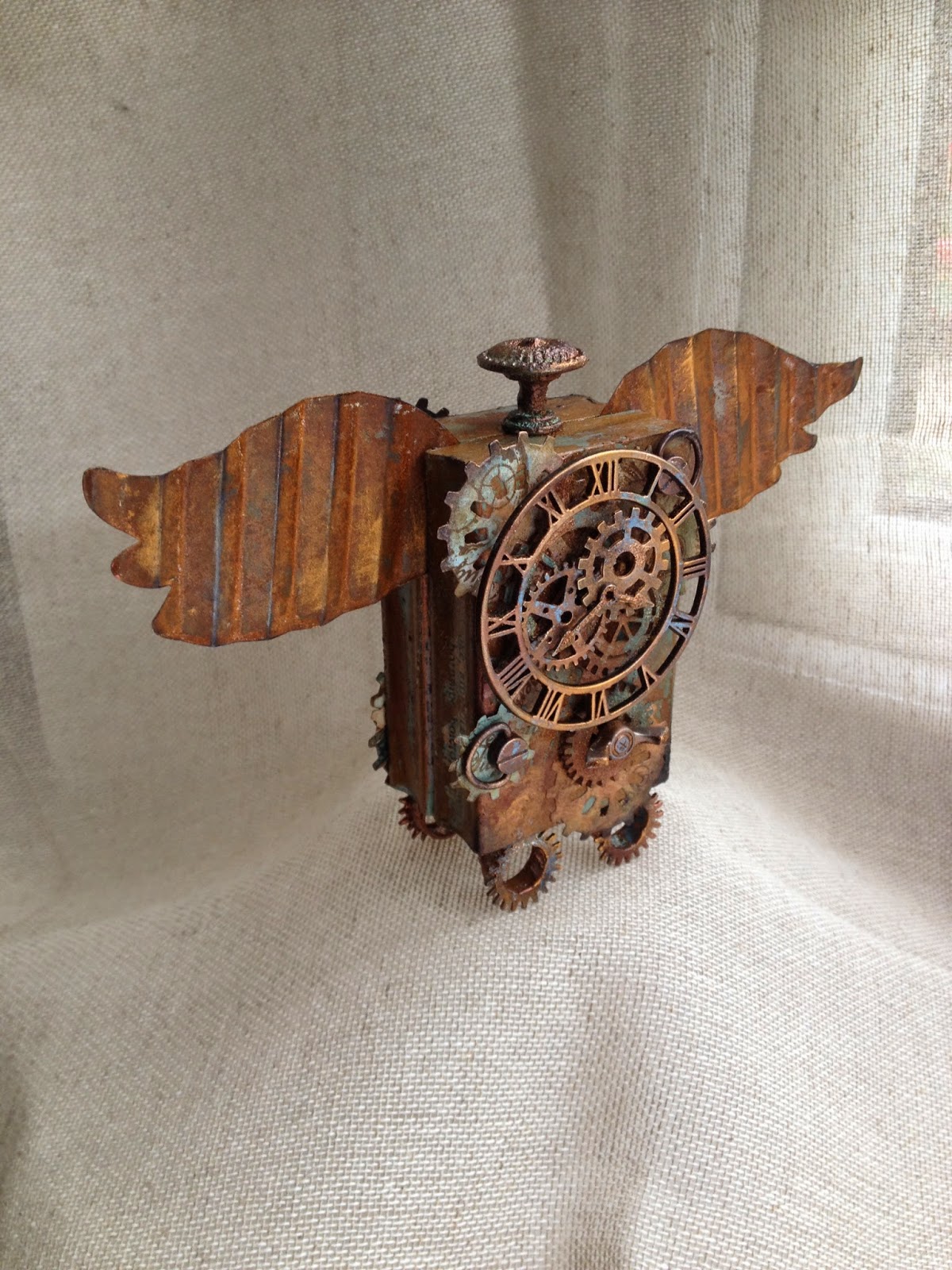
The clock has different tones in a different light.


This clock started out as my sons Postman Pat clock many moons ago and then was changed to a 'space theme' (very amateurish I know but it was 20 years ago) and that's how its been until yesterday waiting for a makeover.


I used several fresco paints including yellow submarine, taupe, chocolate pudding, french roast, irish cream, brown shed, blood orange and even started with a base coat of lake wanaka! I applied them with a baby wipe and had blended them quite well but I wanted some definition showing through as I was going to stamp on tissue and apply over, so I added some brush strokes of yellow submarine and irish cream.


I then applied some tinted grunge paste through the 'clockwork' clarity stencil (using chocolate pudding and taupe to tint it). I used a Crafty Individual 017 text stamp to make a further impression in the grunge paste. Once dry I dry brushed through the stencil with some french roast. 
I then stamped a variety of images and text stamps onto one ply of a large tissue using black archival, then heat set. The images used were from PaperArtsy Gentlemen no 3 and no 6, Darkroom door 'Steampunk' and Indigo Blu 'Take the Time'. I then applied the tissue that had been cut to size using beeswax ( yes the meltpot has been in use again).


It was quite easy to get the tissue to go into all the nooks and crannies, although I can see a crease on the bottom right but I think it adds to the aged effect! I added a little more wax to the outside and then used some heirloom gold perfect pearls on the wax. I then forgot to take any more photos until complete, but I used a spellbinders die 'sprightly sprockets' and some G45 paper, sorry not sure of the name but it included steampunk images. I layered these up with some metal embellishments. The numerals are prima mechanicals and although I did have a whole set of large numerals, I wanted to use a few small ones as I just thought it looked better. (the 11 and 12 are a 9 backwards and a 10 and 2 together if that makes sense).
Once they were all stuck down with matte medium I dry brushed with a mixture of little black dress and chocolate pudding over the paper and embellishments to tone them in without totally covering them.


Some of the underneath colour shows through


Detail of grunge paste impression and die cuts


 Lastly treasure gold in indigo, spanish topaz, onyxite and renaissance were used, each over certain areas to finish. The only thing I couldn't change was the shape, though I did toy with extending cogs out of the top and using some metal wings I had, but decided that with all the other additions the shape worked as it is.
Thanks for stopping by, hope you have a lovely day crafting if you can.