Showing posts with label tissue paper. Show all posts

Thursday, 1 February 2018

Off to Collage at Stamps and Stencils!

Hi everyone, Cec is our lovely host for this months challenge... here's what she wants us to do.

'No I am not sending you to school but thought it might be fun this month to make a collage.  You can use any substrate such as canvas, corrugated cardboard, wood, or canvas boards for instance and add any items to it as long as you include some stamping and/or stenciling.'

So I've created a little wall hanging in vintage tones, with lots of layers.


'Collage  - a piece of art made by sticking various different materials such as photographs and pieces of paper or fabric on to a backing'.

I've gone for a slightly different take on this and  decided to go down the using up scraps route and make a collaged background. Taking a cue from Cec, I had a piece of cardboard lying on my desk and that's where I started. Tweezers to rip a few holes in the base and then I've glued down some book text.


Layering all sorts of scraps as a backdrop and then I decided the focal point would be a small photo frame with something in it...at this stage I wasn't sure what though!


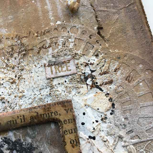
As all the items I was using were neutral tones, I decided to keep to that colour theme and just use a little gesso to tie them together. Lots of dry brushing on the outer edges and a little more centrally. I masked off the framed area so that when I added the image it would stand out.


Love how dry brushing highlights all the texture. Add in some micro beads (art stones), grunge paste through a stencil and the main image (Crafty Individuals) stamped on tissue before gluing down.


Love this effect, it gives such depth to the piece and because it is straight over the collaged elements it fits in perfectly. Some stamping in potting soil archival and paint splats.


More dry brushing in shades of brown (toffee, chocolate pudding and stone) to highlight the texture.


The frame was altered by covering with book text, adding 2 layers of clear UTEE and a tickle of treasure gold.


I enjoyed doing this so much I want to do another one!


Hope you'll join in with our challenge and if you need more inspiration hop across and see the wonderful samples from our very talented creative team! Happy creating! Ruth x

Thursday, 6 August 2015

Guest DT spot at Frilly & Funkie!

Hi everyone, second post of the day! I was absolutely delighted to be chosen as a Frilly and Funkie favourite and be given the opportunity to create a project for their current 'Things with Wings' challenge.


Hope you'll hop across and take a look .


I decided to create a little box canvas and chose  a winged angel stamp from Crafty Individuals. Very vintage colours with a hint of pink.


The embossed sides.


Canvas trim and embellishments.


The final piece. Thanks for stopping by and hope you'll be able to join in with the challenge. 

Thursday, 5 February 2015

'Love is in the Air'

Welcome to the next challenge at ATP Exchange, this time Yvonne is our talented host and has chosen a Love theme.......It will soon be Valentines Day, so my theme is all about Love, what does it mean to you.? A feeling, a look, a touch, a word, something that makes your heart happy.............the list can be endless. So for this challenge, share with us how you see 'love' in your world.


For this sample I've chosen to do a monochromatic theme, with lots of texture and shimmer! 


I picked up this yellow painted mdf piece in a sale last year but similar shapes can be found here. After some light sanding I coated it with Finnabairs black gesso. I then got carried away and forgot to take any photos till it was finished....sorry!


Once dry, PaperArtsy crackle glaze was applied to the sides of the letters and then a coat of snowflake fresco. I coated the front of the letters with Wendy Vecchi's crackle embossing paste .


The text stamp from the Mercantile set....'we come to love not by finding a perfect person, but by learning to see an imperfect person perfectly...' was repeatedly stamped on tissue and then ripped and applied to the word in sections with soft matte gel.


Once dry all the surfaces were coated with PaperArtsy metallic glaze....it does give a lovely shimmer. Pewter Treasure Gold was also used on the edges.


I painted a piece of Smoothy stamping card with metallic glaze and then stamped number images from ESN07 set. I cut out 4 heart shapes and then used a black glitter embossing powder around the edges. Another coat of metallic glaze was applied before using glossy accents on each heart.


To finish I used the same black embossing powder on the base of the letters, and the hearts were secured before wrapping some silver wire and a bead around each one. Hope you'll have chance to join in and show us your interpretation of  Love over at ATP Exchange and please do hop across and see what my talented team mates have created to hopefully inspire you.

Thanks so much for stopping by and Happy Crafting!

Saturday, 29 November 2014

Faux Chine Colle and a few other things.

Faux Chine Colle? I hadn't heard of this before I read the Joan Bess book 'Gelli Plate Printing'...which I can highly recommend. Briefly it's a collage of fragile papers on to heavier paper before printing on them, there's a link here to the Gelli Arts You Tube video which demonstrates it beautifully.


I only prepared one piece of card just to try it out and decided I'd make a card for my stash . I'd recently bought a few golden acrylics in primary colors that were translucent as I wanted to try layering colours with the gelli plate.


I tried to use the colours that are used in the video I've linked but I added a bit to much yellow to the blue and although I loved the collage effect, I didn't like the mix of colours especially the green...it reminded me of my science lab coat from school!!!... no I had to change it.


I've started by using some darker green colouring pencils just around the edges of where the colours meet and some verdigris embossing powder.


Next some gilding flakes on the yellow areas, looking better but still not quite right so more shading using red and purple.


Great technique, will be trying that again. I've realised that Gelli prints can be perfect as there are, may just need some additions or be a great starting point for a background. So thats Faux Chine Colle but I thought I'd also just share a few other cards and things I've been playing around with.

Carrying on with Gelli plate printing and translucents, I had a further play around mixing from the primary colours and pulled off the following prints.


 Love this first one for the colours and the fibre imprint 


Below is a new joggles stencil, the result reminding me of fireworks.


Lastly this was with silk glaze, difficult to see but the whole print shimmers. 


Just need to make some cards with them now.......speaking of which I have another card to share with you. 


 The first one and this are for 2 upcoming male birthdays. I don't tend to make complicated cards, often going for CAS, certainly for the males in my family. The background is an alcohol ink one and the map stamp is PaperArtsy. The bird and text is Stampers Annon classic...love the bird which I've UTEE'd, I've also added some alcohol ink to the compass coin.

Last on the card front, I finally got around to finishing off the cards from this post here and decided I would split it into 2, I think I prefer them like this.


And finally if you've stayed with me I've just a couple of pics from 2 workshops I've attended in the last few months at the Artist Trading post. The first is a pic from the Kasia one where we made a scrapbook page...this was a bit out of my comfort zone, partly because I like to think about what and where I'm putting things but this was don't think just do, which was actually quite liberating in the end and I picked up lots of tips


The photo is my mum when she was about 10.

This last photo is from Sue Carringtons  Lynne Perella 'beer mat' workshop. If you ever get a chance to do one with Sue, you won't be disappointed, you'll learn loads about techniques and there really enjoyable. Love how this turned out.


 Anyway I'll sign off now for November....I'm off for my early Christmas present of Finnabairs workshops at ATP, I'm just a bit excited!!

Thanks as always for stopping by, hope you enjoyed a slightly different post.

Sunday, 1 June 2014

Altered clock...part 2

The original challenge was to change or alter something and I'd thought about this project earlier in the week but hadn't had time to do anything until yesterday, which is why I was last minute Lucy!....now I've just found out that Country View Challenge this month is 'Only Men Allowed' (and this piece does have a strong male theme)....although this is a new post today with all the details and therefore isn't a backlink, I'm not sure it qualifies, as I posted a pic last night...however  as crafting is about sharing and I hope some of the techniques may be of interest, I will take the risk as they can always unlink me.

The clock has different tones in a different light.


This clock started out as my sons Postman Pat clock many moons ago and then was changed to a 'space theme' (very amateurish I know but it was 20 years ago) and that's how its been until yesterday waiting for a makeover.


I used several fresco paints including yellow submarine, taupe, chocolate pudding, french roast, irish cream, brown shed, blood orange and even started with a base coat of lake wanaka! I applied them with a baby wipe and had blended them quite well but I wanted some definition showing through as I was going to stamp on tissue and apply over, so I added some brush strokes of yellow submarine and irish cream.


I then applied some tinted grunge paste through the 'clockwork' clarity stencil (using chocolate pudding and taupe to tint it). I used a Crafty Individual 017 text stamp to make a further impression in the grunge paste. Once dry I dry brushed through the stencil with some french roast. 
I then stamped a variety of images and text stamps onto one ply of a large tissue using black archival, then heat set. The images used were from PaperArtsy Gentlemen no 3 and no 6, Darkroom door 'Steampunk' and Indigo Blu 'Take the Time'. I then applied the tissue that had been cut to size using beeswax ( yes the meltpot has been in use again).


It was quite easy to get the tissue to go into all the nooks and crannies, although I can see a crease on the bottom right but I think it adds to the aged effect! I added a little more wax to the outside and then used some heirloom gold perfect pearls on the wax. I then forgot to take any more photos until complete, but I used a spellbinders die 'sprightly sprockets' and some G45 paper, sorry not sure of the name but it included steampunk images. I layered these up with some metal embellishments. The numerals are prima mechanicals and although I did have a whole set of large numerals, I wanted to use a few small ones as I just thought it looked better. (the 11 and 12 are a 9 backwards and a 10 and 2 together if that makes sense).
Once they were all stuck down with matte medium I dry brushed with a mixture of little black dress and chocolate pudding over the paper and embellishments to tone them in without totally covering them.


Some of the underneath colour shows through


Detail of grunge paste impression and die cuts


 Lastly treasure gold in indigo, spanish topaz, onyxite and renaissance were used, each over certain areas to finish. The only thing I couldn't change was the shape, though I did toy with extending cogs out of the top and using some metal wings I had, but decided that with all the other additions the shape worked as it is.
Thanks for stopping by, hope you have a lovely day crafting if you can.

Saturday, 17 May 2014

Pretty in pink

Just before I started to write this post, I had been blog hopping and I've just read about Ranger discontinuing the meltpot in this post on The Artistic Stamper blog.........I can only hope it will be back in some form or another, mine is still working and hopefully will continue to work for a very long time especially since I took a meltpot class with Hels.
Yes it has been dusted off again and I am enchanted with beeswax at the moment. Here's my entry for The Sunday Stamper challenge, 'Pink'


Using beeswax is a great way of being able stamp on an uneven surface. I picked up a couple of very rough wooden hearts in a sale section and you can see the before and after of using some fresco paints straight onto the surface.


I don't think I am giving too much away by saying you stamp onto tissue and then apply to your piece. The stamps I've used include probably my most used stamp, the flourish from Crafty Individuals, I've also used their text stamp and the sequin waste stamp is from The Artistic stamper. I didn't want there to be too much black so I highlighted areas of the flourish with a gold Posca pen.


You can also see the drips of wax (love them) and treasure gold in renaissance and spanish topaz on the embellishments. I painted the embellishments first with Luminarte 'Black Ice' silk acrylic glaze and have also used it to edge the heart. I bought a set of six mini acrylic glazes to try and hadn't realised there was a black in with it and at first thought it was just black paint but no it has a touch of glimmer in it...lush.


Hopefully you can see the shine from the mica applied over the wax  (perfect pearls blush and a deep pink mica). Hopefully pretty but with a hint of steampunk. Thanks for stopping by. 

Saturday, 29 March 2014

Sunday Stamper challenge '300'

Well a bit late, only because I craft at a weekend,  so I am either early or last minute but ideas buzz round my head in between....I'd hoped I would be submitting a chunky ATC but after 2 hrs Mr Mojo exited and it went from bad to worse so I'll have to go back to the start with that one. However not to be beaten especially as it's the 300th this little hanging came together fairly quickly for 'Dream'  In fact it's not quite dry.


I stamped the butterflies on to 1 ply tissue (idea from Hels) and you can probably see a slight haze around the bottom one...because it is still a little wet.


I've used my favourite fresco paints, CW stencil, Kaisercraft Butterflies and treasure gold...........and I have managed to load the logo as well!