Showing posts with label infusions. Show all posts

Saturday, 19 January 2019

Album part 2...

Back again to share more of the mini album or journal I created. A few details, some photos and I've quickly made a flip through video. Any questions I've not answered just leave a comment and I'll reply. I really appreciate all the interest and lovely comments and for many reasons I'm so glad I was given this creative opportunity.


Grid background stamped, masked and then stamped again to create a larger background with WOW seafoam white EP


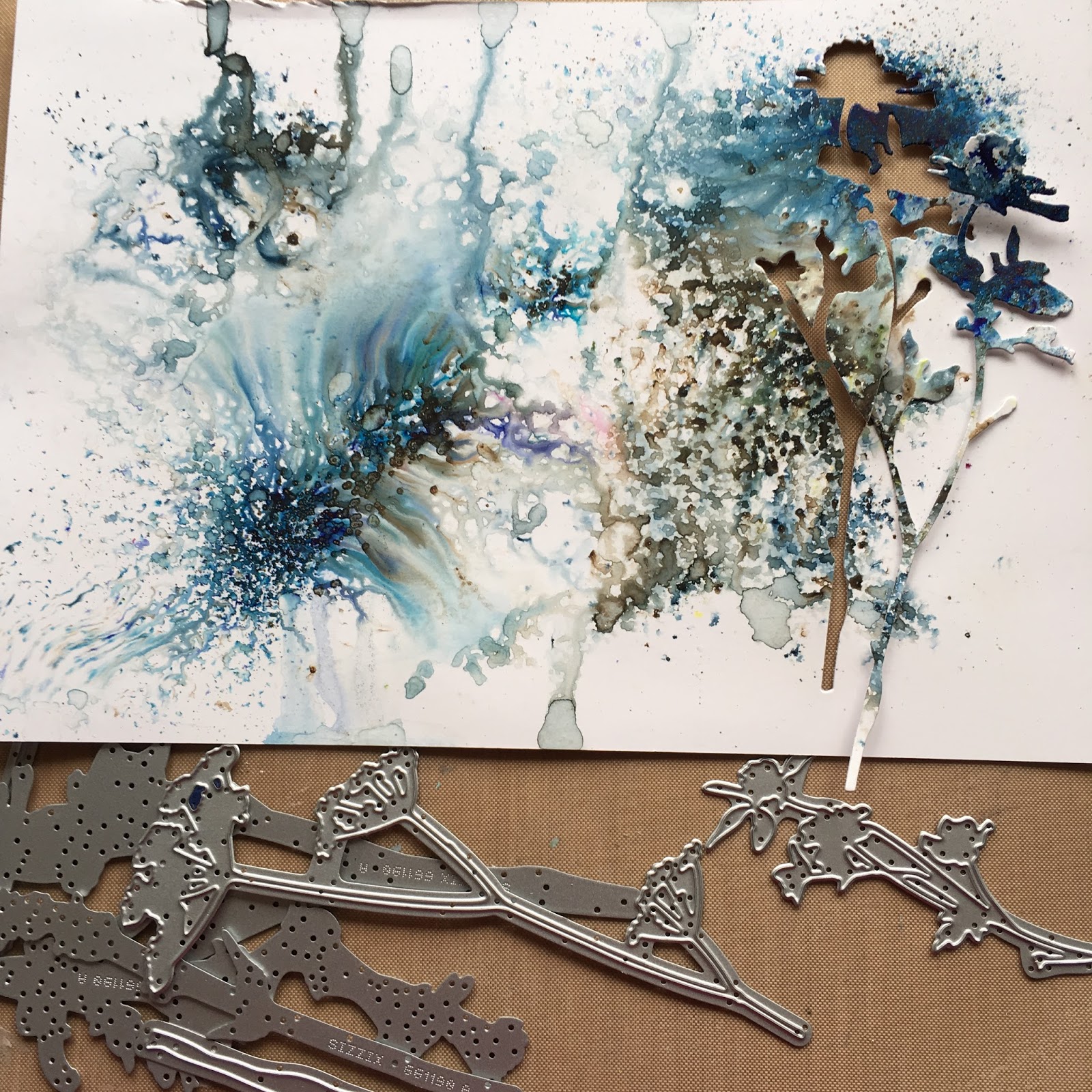
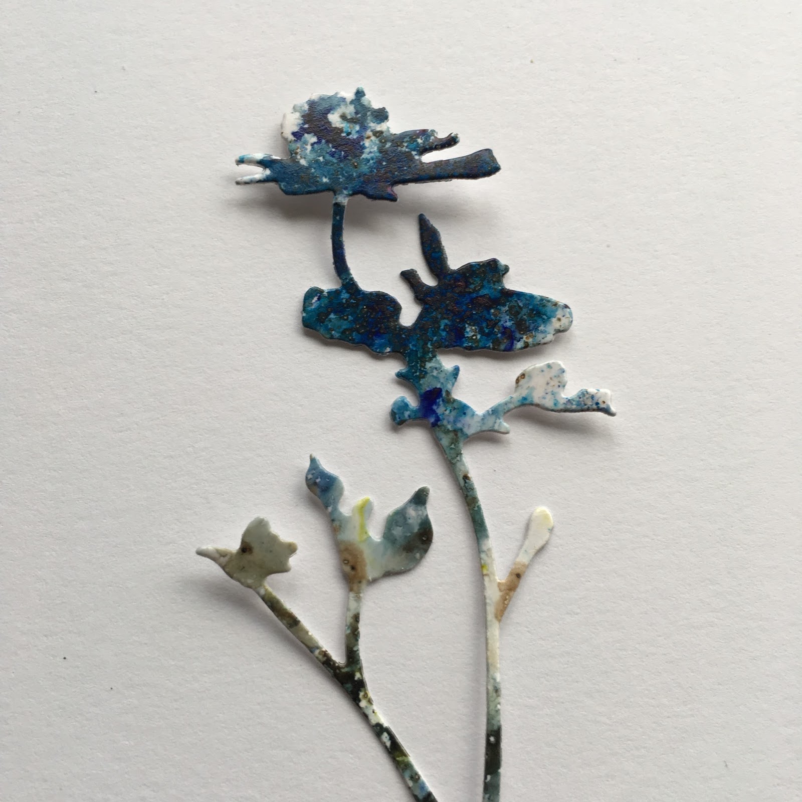
Yes it's a trimmed down version of the Eileen Hull travel journal. Olive tree infusions throughout and the gold splats are Winsor and Newton gold metallic ink, you only need a tiny amount watered down, a little goes a long, long way. The ink just has that bling I wanted and soaks into the cartridge paper.


The hand is stamped with infusions. To recap, use versamark on the stamp first then rub in a little infusions, spritz and stamp onto cartridge paper, dry with heat gun and then splat with the gold ink or splat before drying; I used both ways in the album. The infusions will reactivate when they get wet and just mingle a little more. You can also re spritz with water to get a few impressions.


The pages were decorated after assembly to give unity to the lay outs and I used pieces of spare cartridge paper under the sheet edges to protect the pages below and in the process realised I'd got some great coordinating paper to use on the edges of other pages.


I used archival ink in two tones for most of the other stamping and WOW bonding powder on the die cuts to enable me to add some foiling.


Here's the video and as it's a walk through you can just pause to see the pages in more detail. No audio on this occasion.


Lastly just to show the versatility of the stamps, a simply stamped card in subdued colours with some bling. I love subdued, neutral colours with a touch of bling.


My top 3 favourite stamps from the A5 sets are on this, the spring, watch and sketchy spiral. My favourites from the minis are the hand and seek....but that's if I really have to choose!

Thanks for stopping by. Hugs Ruth xx

Thursday, 17 January 2019

New Seth Apter stamps at PaperArtsy!!

Hi everyone, super excited to be sharing my 'playtime' with the fabulous new Seth Apter stamps over on the PaperArtsy blog tonight! The stamps were released yesterday with 2 A5 plates and lots of minis!!
Inspiration really hit me with these and I used them all in creating a mini album. I'll be back soon with a run through of the album but will just share a couple of pics to whet your appetite...hop across for more details.


Front, loving the seek mini and grid stamps


Circles, circles, I do love circles. White embossing powder, fresco paint, infusions and of course gold....what's not to love!


Can't wait to show you what's inside!

Ruth x

Thursday, 5 April 2018

In the Meadow at Stamps and Stencils

Hi everyone, time for our next challenge at Stamps and Stencils and this month the lovely Rachel has chosen the theme which is all about meadows...

'Meadows are such amazing places - lots of different grasses, wild flowers and wonderful wildlife. Let your imagination run wild ...and use stamps or stencils too! Enjoy!'


What a lovely topic, time for fresh spring colours and I created some journal pages which is something I've not done for a while.


I like working on Kraft card and scraped gesso and some of the new blue paints from Seth Apters winter set, think Venice Blue, Steel Grey and Double Denim are making an appearance today. Floral and square stencils used on the first layers.


I've used one of my own hand carved stamps here as it matched in quite well with the geometric  elements.


More layering and stamping with a  little Toffee and Caramel paint.


Glass Bead gel, Treasure Gold and Decoart White Crackle paste.


Sleight Blue and In the Navy infusions on glossy card stock before die cutting with Tim's Wildflower dies.


Isn't the effect pretty?


I used the waste as a stencil  too.


White textured 'earth' for the flowers to grow out of.


I do like texture..


Love the contrast of the glossy flowers against the background.


Hope you're inspired to join in, hop across here for more inspiration from the design team and as always thanks for stopping by. Ruth xx

Sunday, 22 October 2017

Mosaic frame at PaperArtsy

Hi everyone, I have a post over on the PaperArtsy blog tonight. I've been exploring all things pearlescent making a faux mother of pearl effect frame and combined it with a lovely Lin Perella stamped image.


Hop across for all the details. R x

Saturday, 26 August 2017

A Paris Journal

Hi everyone, well I've finally finished my first journal using Eileen Hull's Journal Die. It started off as funky but quickly turned shabby chic...so I tried to create a little vintage style Parisian elegance. It's more of a Traveler's notebook than a junk journal with lots of room for making notes and it's not too chunky so will fit in a bag easily. Am I going to Paris? Not that I know of..but it will definitely be going with me when I do!


I've also created a little flip through video which I'll share at the end of a rather long photo heavy post. Before I start though I want to thank Anne Redfern for her generosity and helping me out whilst I waited for my die to arrive and also for her many inspirational posts, this one is a particular favourite and Jenny Marples has been fairly busy herself creating gorgeous inspirational videos like this one, which is where my I picked up the tip about using a band of Sari silk ribbon to close the journal. THANKS to both of you!

This may be the first of many journals as I really like this die...

The cover was asking for grunge paste through a large lacy stencil, this is one I've had for ages, picked up in a sale and I'm not even sure who made it. Once covered I use Fresco paint in Nougat and then sprinkled infusions on and spritzed with water before heat setting. A little archival ink and treasure gold highlights the texture. Stitching and metal foil to finish.


As you can see lots of stencils and all my french or elegant style stamps came out. The stamps in the top left are an elusive image set and unfortunately aren't available anymore but photo realistic stamps would work brilliantly. Why Paris, well I was looking for a word to 'bump' stencil onto the plaque and the Scrapcosy stencil showing the word PARIS just sealed the deal as it fits perfectly over that wonderful crackled paint effect. Raquel of Scrapcosy has also made several videos using infusions and the link here covers infusions with Fresco paint.


I used walnut ink to stain the ribbon and white cartridge paper for a lot of the pages as I find it works beautifully with infusions.


The crackle effect on the front can be changed into gorgeous large cracks just by applying the paint thicker. I've used infusions a few different ways, the first page is spritzing water through a stencil having sprinkled the area with infusions, then monoprinting other areas with the infusions remaining  on the stencil.


Stamping and embossing on tissue paper pockets.


Stamping with versamark before brushing on infusions and spritzing, extra stamping in gold and brown archival and a few splashes of walnut ink.


All those punches I've been hanging onto were put to good use and splashes of white paint helped to age parchment writing paper. Stamps I've hoarded from childhood that hopefully aren't worth anything came in use.


As well as scraping white paint over Kraft paper as a base for journalling, it was very effective just stencilled on.


Several different colours of Infusions were used, think this is Violetta....love!


Waxed Kraft paper embosses beautifully and made some lovely stitched pockets for tags.


Another way of stamping with Infusions is to sprinkle them on to the stamp, rub in and spritz the stamp with water.


I imagine writing across in this journal starting at the edge of the images so there is a curvy flow of memories flowing down the page.


Of course there is room for tags and little souvenirs to be tucked away in flaps and pockets.


I'm itching to make another one but will content myself with leafing through this one for a little while longer....and if you want a walk through of the journal then here's the video.


Thanks so much for stopping by, hope you enjoyed your visit and enjoy the weekend. R x

Saturday, 11 March 2017

Framed Botanical Print for PaperArtsy

Hi everyone I have a post over on the PaperArtsy blog tonight using some favourite products of mine for the current challenge theme 'Paint and Infusions'. Here's a sneaky peek...


...hop across for all the details here.

EDITED - thought I'd just share a  few more  close up details of the steps.

The frame before it's coat of varnish and treasure gold


The flowers - infusions, pearl glaze and stamping.


The watercolour effect with additional stamping in paint and infusions....


...I'm really pleased with how this turned out. R x


Monday, 27 February 2017

Infusions and a little rust...

Hi everyone, following on from my last post I've made a few cards using a mixture of Seth Apter and Lin Brown stamps. The first is all Seth's, I really liked the tag and star elements with script on them so I also created a little rust project and card following his monoprint technique that I was lucky enough to catch him demoing on periscope.

(I'm entering this card into the current  PaperArtsy challenge which is all about Infusions and Paint)


This is another print from a stencil, I've used Sleight Blue and Olive Tree on this one.


I used the edge of the star to make white lines with a sharpie.


The circle is the original piece of card I stencilled paint and sprinkled infusions through and the star is a piece of card swiped with infusions and paint. Using the same colours but in a different way helps the images stand out from the background.

Next I've used In the Navy, Green Man and yes Sleight Blue for a quick card.


I gessoed through a number stencil to create a resist before using infusions and then gently sanded back.


I added some crackle glaze to the numbers to help the tag stand out more, there is also a hint of treasure gold.


A piece of rusty fabric stamped with the hinge from a Lin Brown set, is tucked underneath, and I added in a rusted metal piece, black cotton and some robo die cuts.


It's great that you get the odd pop of pink or violet in places.

Next having seen this demoed I picked a piece of left over book board I had and was just going to have a play but couldn't really believe how easy and effective this was. You monoprint with paint from a piece of card.


Not sure if I pressed too hard or was using a very cheap piece of card to monoprint from at first..I changed to watercolour paper after the first disintegrated...but little blobs of paint appeared which I'm not sure were meant to...but I was happy.


This is the easiest rust I've ever made.


I added some home rusted paper clips...


...and a washer.


Next I had an idea for creating some rust in the centre of a card...Seth style, CAS and one layer??


I've used a mixed media paper containing cotton which gives a lovely ragged edge.


Some stitching and a little metallic finish it off.

 Thanks so much for stopping by again, I need to walk away from the infusions now...well just for a little bit!