Saturday, 16 August 2014

Time flies...

oops 2nd attempt to post!

A few months ago I mentioned I'd been trying to make a chunky ATC for one of the challenges but that Mr Mojo decided to leave the building, and so he has been sitting there forlornly looking at me from the corner of my work space ever since. However here he now is in all his rusty grungy glory (not sure why he is a he but he is).  Hopefully he will now sit happily on my shelf stretching his rusty wings.
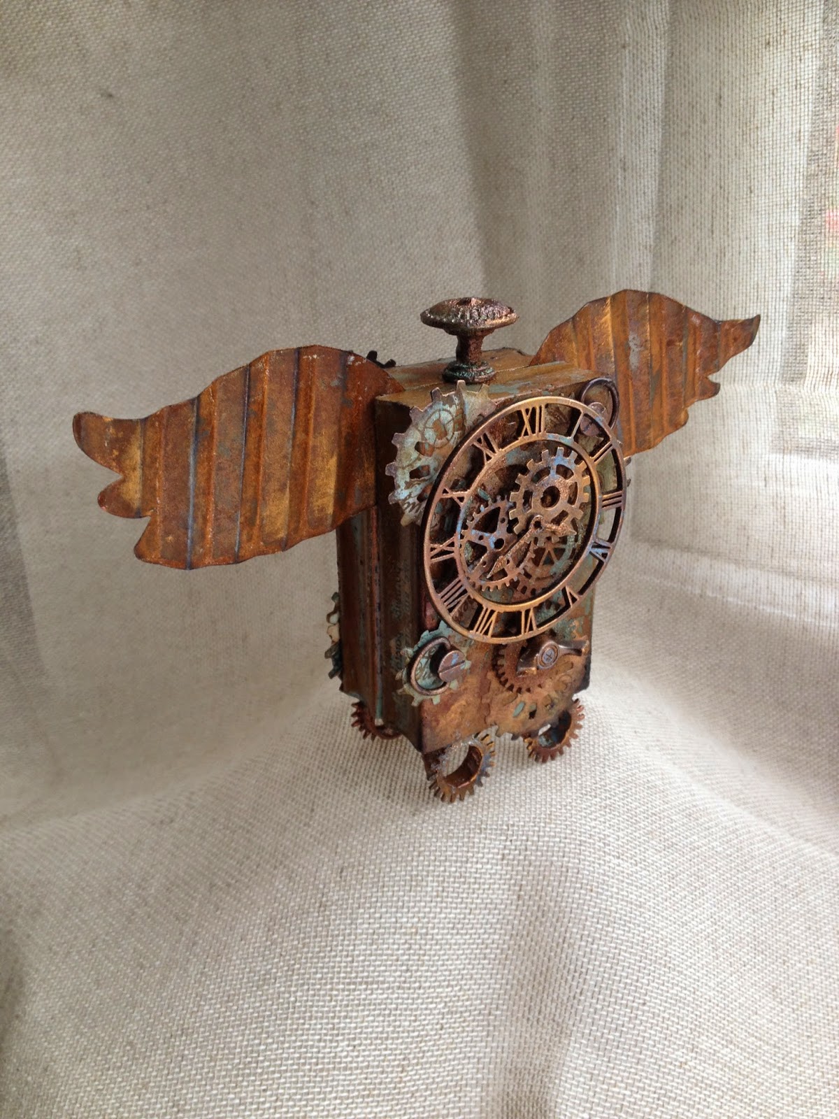


He started off as two wooden stamp mounts (I decided to turn some of my wood mounted stamps into unmounted stamps, but I kept the wood of course). I knew I wanted him to have rusty wings and then a couple of challenges came up that inspired me and pushed me into finishing him. The blocks still had some remnants from my first attempt so I covered the blocks with terminology tissue wrap.


I used broken china and antiqued bronze distress paints for the eroded metal effect of Tim's and wanted to continue this effect throughout.


I already had these die cuts and circles in my stash and the colours just lent themselves to the project. I stamped in potting soil archival on both with some craft stamper free stamps, one is appropriately 'Tempus fugit' (time flies).


Part way through assembly. I've used paper and metal embellishments. I've also used verdigris, black and copper embossing powders, black archival and treasure gold in florentine, spanish topaz and onyxite. 

Some close ups of his rusting body.


Over at 'A Vintage Journey'  they celebrate all things Tim influenced and it definitely is inspired by his vintage grungy approach and techniques, just hope it's eligible. I'm entering for the first time, it's only their 12th challenge!...although I've followed it, I've just not been able to enter before; the theme this time around is of course...'Time Flies'. 

I'm also pleased to be able to enter one of  SanDee & Amelie's Steampunk challenges for the first time as well. This time it's for the Summer bonus challenge which is based on a mood board, I think I've used virtually all the colours and the corroded metal cogs and gears but just lightened with a bit of blue.

Lastly I'm entering it in the Craft Stamper Take It, Make It August challenge , this month the challenge is to use any of the techniques demonstrated in Craft Stamper this year so far. From June 2014 I've used the eroded metal effects (Distress to Impress) but from the same issue I also used the blistered paint technique (Blistering Barnacles) on some of the metal work and was inspired by Trish Latimers masterclass on inventive feet. I enjoyed doing it... and that's all that matters, thanks for stopping by and hope you enjoyed the post.

Wednesday, 13 August 2014

Faded layers...naturally.

I've made it...and in good time! I've been disappointed not to be able to join in with the last few CC3 challenges, (so little time, so much to do), but I have a few days off at present so I am happily 'creating'. We are on numero 8 now and it's the faded layers technique (page 58). This time The Funkie Junkie boutique are sponsoring the challenge and the lucky winner will receive a $25 shopping spree. Here's my entry for Challenge 8. I've altered a notebook.


Front..


...and back.

This technique really surprised me, I absolutely love the effect it creates. You have to see it in real life, it really has a wow factor....well I think so anyway. Why two tone?


Well, I originally thought I'd do blues or a bright colour but as I was also wondering what to do for Hels Sheridan's The Sunday Stamper challenge which this week has a natural theme.....I thought why not? Always one for experimenting, though this may have all been done before? I set off down the natural route. Now some may think there is a brown theme developing with my CC3C entries, I do other colours, honest, it's just the way it's worked out (there has been one greeny blue entry so far).

So without giving the technique away, I started with a £1 notebook from a sale. I took the covers off.


I'd had an idea about light stone colours, patchworking them and white embossing, so I tried a few colours and used the technique. The colours I've used were the same for both ( brown, orange, yellow) but I used some gold metallic mixatives on the dark and snowcap white on the light. I used the stencils below.


I couldn't choose between the pieces so decided to use both.  The one on the left has been sectioned but I kept the page pattern as it was. The one on the right I chose to mix up the sections. I've also punched the holes for the spine and the elastic that closes the book. Before stitching with a wonky zigzag I stuck the pieces onto a piece of photocopy paper.


I did think about mixing them together (below) but preferred the above arrangement.


I wanted to keep the stamping and additions simple so the technique/ background could be seen....(learned my lesson from the previous post!)


Stamp sets I've used are Bird Feather, Mercantile and I think it's Haberdashery? I stamped the images in white before sewing as I knew the feather would cross the cut areas. The black stamping was done after sewing and I've used some remnant rubs. Then attached the pages to the covers with matt multi medium and I've just used a couple of idea-ology pieces to finish and attached them with a swivel clasp. I tinted the pieces with antique linen distress paint. I didn't add too many pieces as I want to be able to slip it my bag and use it to make notes or journal on the go.

Update, couple of close ups, I meant to add..


So this is my entry for CC3C and The Sunday Stamper, both links above. Hope you enjoyed it and thanks so much for stopping by. 


Monday, 11 August 2014

Journal...take 2

Hello, I thought I'd share a couple of journal pages with you, well there are 4 here really.....4..really? Well I 'overdid' the first 2, but as there are no mistakes in art, I adapted and part of the first 2 are on the second  2 page spread below. Not sure whether that's the creative process...or I am just stubborn and want to make things work!
I am entering this in Country View Crafts August Wordplay challenge which is about the written word and I've included a rather lovely quote from a Lin Brown stamp set. I am also entering this in Our Creative Corners Summertime challenge as I'm thinking of red sky sunsets, flowers in full bloom and seed heads starting to develop in late summer..... though the way the weather has been this weekend we may have missed that part!


You may be aware that I tend to do one page spreads, because 2 large pages are still a bit scary to me; but this is my little finnabair journal and I shared a 2 page spread a few weeks ago that I had made at a fab Lin Brown workshop. Whilst we were there we printed onto fabric using a gelli plate.


I stuck a fabric piece straight in to my book on the left and on the right is the second print which is on photocopy paper. I hadn't been able to decide how I could move forward on this without obliterating the background, which I loved. Anyway I decided to start and I used translucent embossing paste, glass bead gel, several stencils, stamps, gilding wax, glimmer mists, glazes, gesso, the kitchen sink...


Yes unfortunately as you can see I sadly 'nuked' it, no white or even light space at all.....I decided to remove the pages and then thought could I use part of them? I'd already wiped my brush on another 2 pages so decided that was the starting point.


I applied some gesso with an old credit card, then peach glimmer mist and blue colourwash spray through stencils. I then randomly stamped in hydrangea archival with a CI stamp. A little more stenciling with chestnut brown silk glaze and sprays, then some white paint circles with a bottle top. I was able to peel the fabric from the paper and trim it by tearing. I also cut around the onion skin stencilled texture paste areas to reuse them; I thought they looked like seed heads especially as they were gilded. Here are some close ups.


Glass bead gel, gilding wax and seed heads.


Stencilled flower heads in translucent embossing paste, glass bead gel with primary element pigments and faux stitching.


Below is my favourite part because the fabric still has some of the original pattern showing. I'm happy with the finished result as the more I look, the more I see and the more I like it.


I still have this piece of fabric which has only been colour sprayed....will save that for another time.


 Thanks for stopping by and hope you enjoyed a rather photo heavy post.