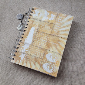
I've made it...and in good time! I've been disappointed not to be able to join in with the last few CC3 challenges, (so little time, so much to do), but I have a few days off at present so I am happily 'creating'. We are on numero 8 now and it's the faded layers technique (page 58). This time The Funkie Junkie boutique are sponsoring the challenge and the lucky winner will receive a $25 shopping spree. Here's my entry for Challenge 8. I've altered a notebook.
Front..
...and back.
This technique really surprised me, I absolutely love the effect it creates. You have to see it in real life, it really has a wow factor....well I think so anyway. Why two tone?
Well, I originally thought I'd do blues or a bright colour but as I was also wondering what to do for Hels Sheridan's The Sunday Stamper challenge which this week has a natural theme.....I thought why not? Always one for experimenting, though this may have all been done before? I set off down the natural route. Now some may think there is a brown theme developing with my CC3C entries, I do other colours, honest, it's just the way it's worked out (there has been one greeny blue entry so far).
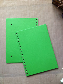
So without giving the technique away, I started with a £1 notebook from a sale. I took the covers off.
I'd had an idea about light stone colours, patchworking them and white embossing, so I tried a few colours and used the technique. The colours I've used were the same for both ( brown, orange, yellow) but I used some gold metallic mixatives on the dark and snowcap white on the light. I used the stencils below.
I couldn't choose between the pieces so decided to use both. The one on the left has been sectioned but I kept the page pattern as it was. The one on the right I chose to mix up the sections. I've also punched the holes for the spine and the elastic that closes the book. Before stitching with a wonky zigzag I stuck the pieces onto a piece of photocopy paper.
I did think about mixing them together (below) but preferred the above arrangement.
I wanted to keep the stamping and additions simple so the technique/ background could be seen....(learned my lesson from the previous post!)
Stamp sets I've used are Bird Feather, Mercantile and I think it's Haberdashery? I stamped the images in white before sewing as I knew the feather would cross the cut areas. The black stamping was done after sewing and I've used some remnant rubs. Then attached the pages to the covers with matt multi medium and I've just used a couple of idea-ology pieces to finish and attached them with a swivel clasp. I tinted the pieces with antique linen distress paint. I didn't add too many pieces as I want to be able to slip it my bag and use it to make notes or journal on the go.
Update, couple of close ups, I meant to add..
Update, couple of close ups, I meant to add..
So this is my entry for CC3C and The Sunday Stamper, both links above. Hope you enjoyed it and thanks so much for stopping by.


I am telling you now Ruth,this is going to be a winner. I absolutely love it,I want this!! It just looks like patchwork leather,stunning. I think this is my favourite creation from you,wonderful :))
ReplyDeleteHugs
Donna xx
This is a stunning work of art Ruth. Your paper now looks like old pieces of suede and leather stitched together beautifully. Love your colour choice and am sure this will be a strong entry for winning.
ReplyDeleteJulie x
WOW gorgeous and such neat and tidy sewing!! Glad you kept each cover to it's own cover, much prefer them how you've done them and that white really pops xxx
ReplyDeleteThis is stunning! You really hit it out of the park with your execution of this technique. I would love to hear how you did it so well. I have not finished my project yet, but I must have done this technique 8 times, and finally just went with one--the lesser of all the evils. Great project here!!! Thanks for sharing. Sara Emily
ReplyDeleteI agree with Donna...Looks like a winner too me!...Love all the stitching ...wonderful creation! Jan x
ReplyDeleteIt looks really gorgeous, dear Ruth!!
ReplyDeleteWhat a transformation! I love the patchwork effect too! SO SO SO COOL! Thank you so much for joining on on this Faded Layers challenge at CC3Challenge!
ReplyDeleteIt really is hard to imagine that was a £1 book, it looks fabulous and has such a vintage feel to it. Well done on mastering the technique! Anne x
ReplyDeleteThis is just gorgeous, love the technique.xxx
ReplyDeleteRuth this is LOVELY... I love the look you have achieved with this little book... I love doing that too... but none have turned out this GREAT... Love this... Colors are great too... Love, Light and Peace...Bonnie
ReplyDeleteHi Ruth! Your altered notebook looks amazing! I love the patchwork and the embossing over it. Brilliant!
ReplyDeleteIngrid xx
Loving this Ruth, but also liked the idea of mixing them too. You have done a great job with the technique.
ReplyDeleteHappy crafting, Angela x
Beautiful notebook, Ruth! I love stitching and stamping! Hugs from Slovenia
ReplyDeleteGorgeous! So subtle, and the stitching is just perfect!
ReplyDeleteJan...this is absolutely gorgeous. I so love your "take" on the faded layers challenge. The softness of your more subtle color combinations has made for a gorgeous piece. I love the different rectangles that you have collaged together and then machine sewn to create that stunning cover! This is really REALLY a nice notebook, Jan! I love it ... the faded layers, the stencils you chose, the colors and the originality of your work. Thanks for sharing with us at CC3C. <3 Candy
ReplyDeleteI said "Jan"...please excuse me to that!! I mean to say RUTH!!! This truly is a work of art! <3 Candy
DeleteWow Ruth! your book covers are absolutely gorgeous! I love the colors - and with the book closed you wouldn't know they were different tones! The technique came out beautiful of them - and what great stitching too! How lovely it will be to use this journal for you!
ReplyDeleteSee, Candy got so excited she got your name wrong and I know why!!! This is awesome Ruth, I love the natural look of the inks and the white really makes those images pop... BRAVO, a fabby creation... Thanks for playing along with the CC3 Challenge, hope to see you again soon x
ReplyDelete*quickly changes hat*
And... it fits perfectly with the natural theme of the Sunday Stamper this week so... thanks for joining in with that one too :O)
Wonderful creation Ruth! One of my favourites for this challenge! i love natural palette that you used! Pinned! BArbarayaya
ReplyDeleteWow - this is absolutely adorable, Ruth!
ReplyDeleteLove the subtlety of the "faded" colour look and the stitching!
Hugs,
Claudia x
We should take it in turns with entering CC3C - this time I've no time! Not that I'd stand a chance with your entry now going in. It's superb!!!! Love the contrast with deeper and lighter shades and the clever mix of stencils used. Good luck! Jenny x
ReplyDeleteWow, what a fabulous transformation, Ruth. Love your natural colors and wonderful layers. Beautiful creation!!
ReplyDeleteThank you so much for your visits and appreciation on my blog posts, Hugs.
Absolutely glorious work... I love the faded front cover, and then the bold back - and the stitching adds such fabulous texture. Totally gorgeous. I haven't managed to play at all lately (not even a Tim tag!), sigh!
ReplyDeleteAlison xx